Client project · 2022
Decatur Healing Arts
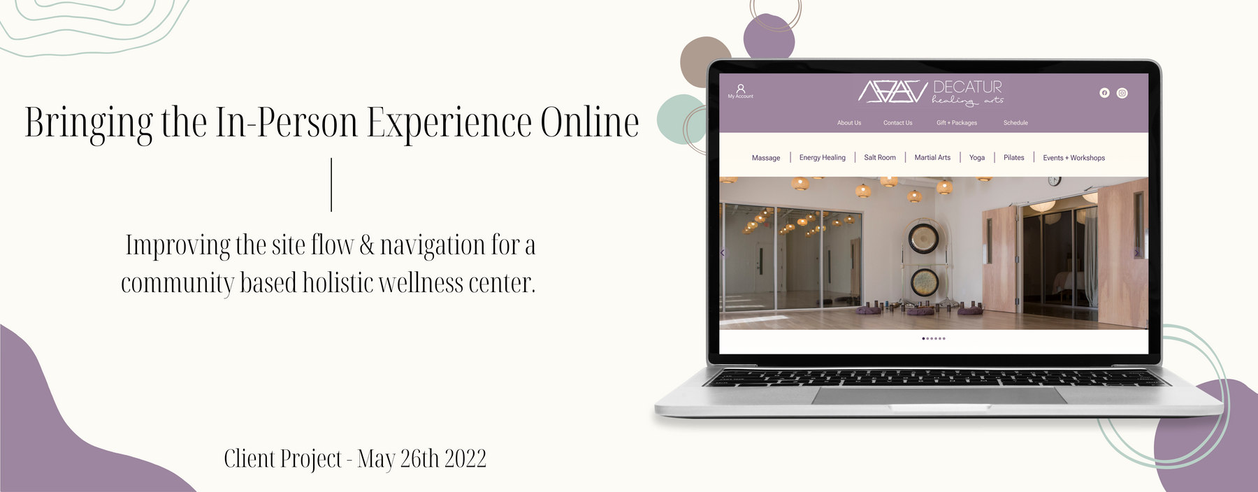
Bringing the in-person experience online for a community-based holistic wellness center.
01
About the client
Decatur Healing Arts is a holistic wellness center with an aim to maintain balance between the four elements (air, earth, water and fire) that sustain life, to ensure physical and psychological well-being. Their goal is to create a community-focused, inclusive, safe and brave space for physical, mental and emotional healing. Decatur Healing Arts has a genuine love for people and is passionate about supporting you on your healing journey.
The Decatur Healing Arts family wanted to redesign their website in hopes of increasing new customer acquisition and 1:1 bookings by reducing the number of inquiry calls about pricing. However, through extensive user research, our team learned that there were other critical roadblocks to booking an appointment online beyond pricing.
02
The prototype
03
Process
To understand users’ mental models and pain points when booking a holistic treatment online, we conducted 8 user interviews, ran usability tests on the current website and collected 10+ card sort results. We synthesized this, along with data from other methods, through affinity mapping and user journeys, which surfaced several root problems with the site and possible solutions.
04
User insights
- Read a business’s reviews before deciding.
- Want all the information about a service before booking: description, benefits, anything to bring, and the practitioner(s).
- Like to see pictures of the space before deciding.
- Find the online booking process tedious.
- Feel the website doesn’t reflect the in-person atmosphere.
- Feel booking and purchasing are disconnected.
- Love the overall in-person experience at DHA!
- The menu structure was confusing.
- The pricing structure felt disorganized.
- The booking calendar was too small and hard to navigate.
- The site felt overwhelming overall.
- Testimonials could be very impactful.
05
Problem
Users need a way to find available service options, understand service details and book efficiently, so that they can make an informed decision and a successful booking that makes them feel safe and comfortable.
06
Solution
By redesigning the main navigation, offering more information about each service (such as its benefits and the ailments it may help treat), and simplifying booking with clear calls to action, upfront pricing and a larger scheduling calendar, we believed we could create a booking process that helps people feel comfortable and confident. These changes are likely to increase online booking rates, and with them, customer acquisition.
Global navigation
A menu bar with sub-menu dropdowns, plus a secondary local navigation for items that didn’t fit among the services, such as About Us, Contact Us, Gifts + Packages and Schedule. This proved more intuitive for users, letting them easily find and browse services.
Service details
Columns showcasing details and benefits for each service. The bullet format makes information easy to digest without being text-heavy, and providing everything up front reduces inquiry calls per service.
Meet the practitioners
A carousel of the practitioners for each service. Selecting one opens an overlay with a short bio and a link to their full profile, so users can get familiar with a practitioner and feel safe booking.
Clear booking & pricing
Clear calls to action for selecting service options and booking, with every pricing option shown on the service page itself. Keeping pricing and booking together creates a cohesive flow, unlike before, when users had to navigate to an entirely different page to see pricing.
A bigger calendar
Last but not least: a larger booking calendar, so users can actually see and select dates and practitioner availability.
07
Next steps
- Tree test to validate the navigation changes suggested by usability tests
- Work out how to translate the designs most efficiently into Squarespace
- Build out content
- Collect healing stories and testimonials
- Photoshoot
- Deploy and measure with site and business analytics